

Mastering Responsive App Design in Qt 6.7: A Deep Dive into LayoutItemProxy
Introduction
Responsive app design has become essential in modern applications, especially with the proliferation of various devices. The web has long been the focal point for ensuring that sites can be viewed seamlessly on both mobile devices and desktop layouts without content distortion.
In the mobile application domain, the adoption of apps that support multiple devices—ranging from mobile phones and tablets to, in some cases, TVs—has necessitated redesigns to meet these demands. As noted in this wired blog, Google has been at the forefront of aligning the user experience to match the tablet layouts with the redesign of their apps, as well as "working with popular third party apps to optimize them for tablets."
Qt in the Space
Qt has traditionally been a go-to for desktop applications, boasting a legacy of industry-standard and professional software. However, the last decade has seen a shift towards other domains like infotainment, mobile applications, web assembly, and embedded GUIs. This shift has been driven largely by the adoption of QtQuick/QML technology for building user interfaces, a departure from the previous widget-based approach that was primarily designed for desktop environments where keyboard and mouse interaction was the norm.
Qt boasts a wide application base usage from before the 2000. It has been utilized in building browsers, media players, utility software, IDEs, CAD/CAM software, Linux Desktop Environments (KDE) and much more. Here is a list of some of the applications made in Qt.
How We Have Been Doing It
With the adoption of QtQuick/QML in mobile application development and other thematic areas, the need for responsive designs to accommodate varying device layouts and screen sizes has become paramount.
For embedded systems like medical devices or car infotainment systems, responsiveness might not be a concern since the GUIs are specifically designed for a fixed screen size, which rarely changes.
To achieve responsiveness, QML has relied on user-created workarounds until Qt 6.5. Here are some methods that have been employed:
- Show/Hide Components: Components are shown or hidden based on the layout, ensuring the correct control is displayed for the specific layout.
- Loaders: Specific
.qmlfiles are loaded depending on the screen size, each designed for particular layouts. - Other Custom Solutions: Developers have come up with various hacks to make their apps responsive.
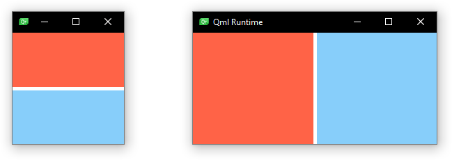
Each of these approaches has its flaws. For example, shipping large binaries containing several files for specific layouts can be cumbersome, particularly in cases where numerous layouts are required. Inexperienced developers may also encounter issues when fiddling with the visibility of controls, potentially messing up layouts. It's important to note that QML controls still occupy their given dimensions even when their visibility is set to false.
QML's LayoutItemProxy
Qt 6.6 introduces the concept of LayoutItemProxy designed to simplify the creation of responsive designs. Think of it as a scaffold that can point to a QML target item from anywhere in the QML hierarchy. This allows for the creation of different layout hierarchies that share the same QML content items.

For each layout hierarchy, let's say a mobile layout, it can contain one or more LayoutItemProxy items each pointing to a common, maybe reused, QML component, but only one layout hierarchy can be visible at any given time. So, the application logic should cater to the logic of switching between the different layouts.
How do we use LayoutItemProxy?
Let's look at an example. A generic application is made up of three main areas, the main content body, the sidebar (which is transformed into a drawer) on mobile, and maybe a top bar (which may hold the toolbars, menus, etc.). If you're familiar with media queries in CSS, this concept of styling the components differently to fit particular screen orientation and size
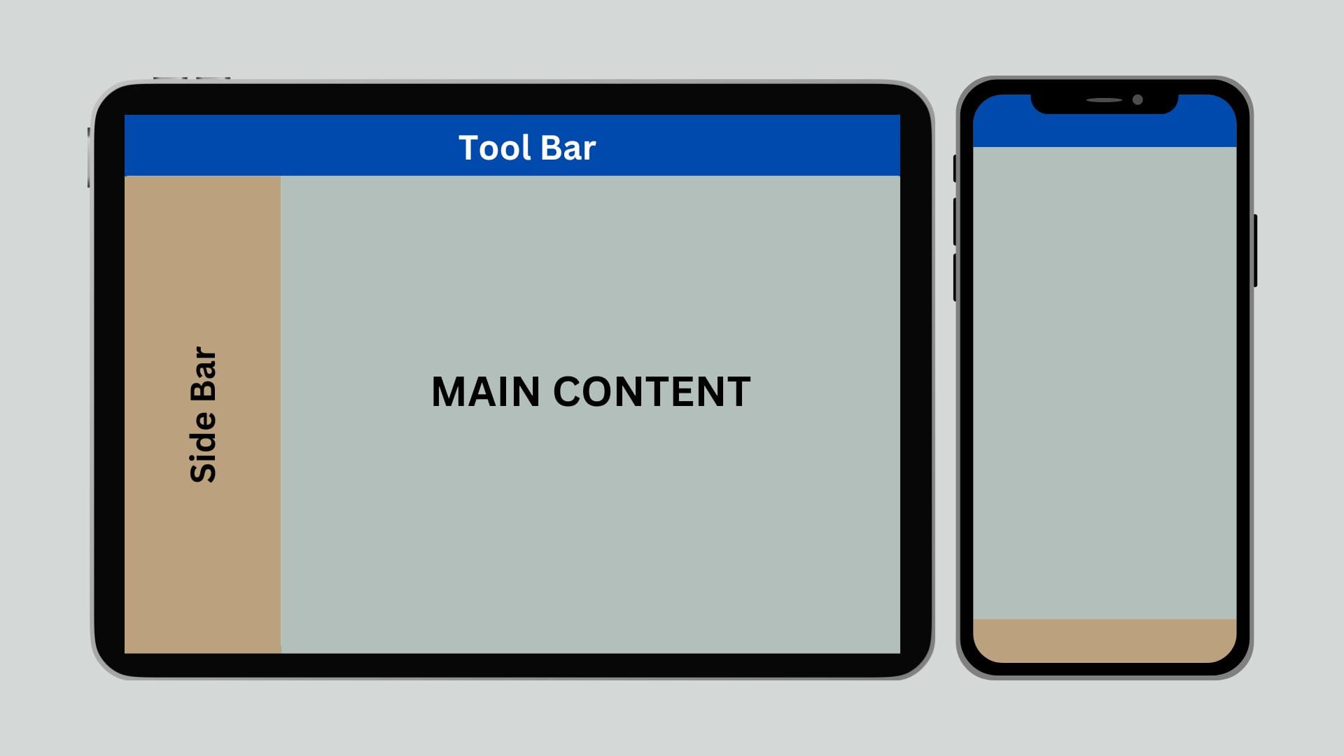
Lets see how to implement the layout above to incorporate three states: A mobile, tablet and desktop sizes. This can be expanded to consider other sizes like widescreen layout and any other desired orientations.
Mobile Layout
The mobile layout comes into effect when the effective screen width (i.e., the width of the application window) is 450px or less. Here, we stack the top bar and the main content in a ColumnLayout and provide an additional Drawer to open the menu options. This is common in Android applications, where the navigation menus are embedded in a left drawer.
```javascript

// Layout for the Mobile
ColumnLayout {
    anchors.fill: parent
    spacing: 1
    visible: isMobileScreen

    LayoutItemProxy {
        target: topbar
        height: 60
        Layout.fillWidth: true
    }

    LayoutItemProxy {
        target: maincontent
        Layout.fillHeight: true
        Layout.fillWidth: true
    }
}

Drawer {
    id: drawer
    width: 300
    height: parent.height
    interactive: isMobileScreen
    edge: Qt.LeftEdge

    background: Rectangle {
        color: "#eee"
    }

    contentItem: LayoutItemProxy {
        target: sidemenu
        width: drawer.width
        height: drawer.height
    }
}
Tablet Mode
This is an intermediate state between the mobile and desktop layouts, activated when the width is greater than the mobile screen size but less than 750px. In this state, the layout is similar to the mobile layout, with the addition of a collapsed sidebar. A collapsed sidebar only shows icons for the menu items, similar to the left sidebar in Visual Studio Code.
```javascript

// Layout for the Tablet
RowLayout {
    anchors.fill: parent
    spacing: 1
    visible: isTabletScreen

    LayoutItemProxy {
        target: sidemenu
        width: 70
        Layout.fillHeight: true
    }

    ColumnLayout {
        Layout.fillWidth: true
        Layout.fillHeight: true

        LayoutItemProxy {
            target: topbar
            height: 60
            Layout.fillWidth: true
        }

        LayoutItemProxy {
            target: maincontent
            Layout.fillHeight: true
            Layout.fillWidth: true
        }
    }
}
Desktop Mode
The desktop mode is similar to the tablet mode but with a full-width sidebar that includes both icons and labels.
```javascript

// Layout for the desktop
RowLayout {
    anchors.fill: parent
    spacing: 1
    visible: isDesktopScreen

    LayoutItemProxy {
        target: sidemenu
        width: 250
        Layout.fillHeight: true
    }

    ColumnLayout {
        Layout.fillWidth: true
        Layout.fillHeight: true

        LayoutItemProxy {
            target: topbar
            height: 60
            Layout.fillWidth: true
        }

        LayoutItemProxy {
            target: maincontent
            Layout.fillHeight: true
            Layout.fillWidth: true
        }
    }
}
The Glue
Switching between the different layouts is handled automatically by LayoutItemProxy, based on the flags set for each component. This feature simplifies the creation of responsive designs, reducing the need for custom workarounds and improving the maintainability of your code.
```javascript

Window {
    property bool isMobileScreen: width <= 450
    property bool isTabletScreen: !isMobileScreen && width <= 750
    property bool isDesktopScreen: !isMobileScreen && !isTabletScreen


    // Layout for the desktop

    // Layout for the Tablet

    // Layout for the Mobile


    // Side Menu
    Rectangle {
        id: sidemenu
        color: '#eee'

        Column {
            anchors.fill: parent
            spacing: 8

            Repeater {
                width: parent.width
                model: 5
                delegate: Item {
                    width: sidemenu.width
                    height: 50

                    Row {
                        Item {
                            width: 70
                            height: 50

                            Rectangle {
                                width: 40
                                height: 40
                                radius: 8
                                anchors.centerIn: parent
                            }
                        }

                        Text {
                            font.pixelSize: 16
                            text: qsTr("Menu ") + (index+1).toString()
                            leftPadding: 8
                            anchors.verticalCenter: parent.verticalCenter
                        }
                    }
                }
            }
        }
    }

    // Top Bar
    Rectangle {
        id: topbar
        color: 'green'
    }

    // Main Content Area
    Rectangle {
        id: maincontent
        color: "orange"
        Layout.fillHeight: true
        Layout.fillWidth: true
    }
}

You can follow along with the YouTube video:
Youtube Video
Conclusion
The introduction of LayoutItemProxy in Qt 6.6 marks a significant improvement in building responsive designs with QtQuick/QML. By providing a structured way to manage different layouts within a single application, it simplifies the development process and ensures that your applications can adapt to various screen sizes with ease. Whether you're targeting mobile devices, tablets, or desktops, LayoutItemProxy offers a flexible and efficient solution for creating responsive user interfaces.
Full source code
 codeartstudios